
Guess what! Another:
Today’s topic:
Graphics, Aesthetics and Animation
If there is one thing that people seemed to be almost universally confused about when it comes to the language of a reviewer, even in reviewers themselves, it would be graphics.
People seem to think Graphics is in fact all three of the above, being actual Graphical Capabilities, Aesthetic Art and the moving Animation.
That is of course wrong.
To show the differences I’ve collected two pictures and a video which will show what each of the words really mean and what the actual difference is.
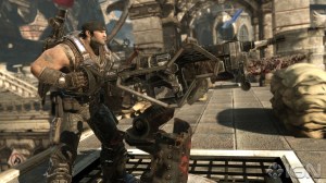

Okay, the first picture is a picture of Gears of War 3.
The second is a picture of Mirror’s Edge.
The third is a cool animation on the internet from the Shock series made by Philips “Terkoiz” Lacanlale.
The picture of Gears of War 3 represents Graphics.
Graphics is not about it looking good. Granted whether it looks good depends on the taste of the player but here is my opinion, I HATE its Aesthetics. It’s every post-apocalyptic cliche in history and it looks boring. Brown everywhere and chest high wall’s obviously there so you can cover behind it. It’s bland and boring and it’s not really something that would make me stay on the spot and watch the scenery because I don’t feel any creativity anywhere.
GRAPHICALLY however, it looks amazing. Look at the texture on the ground, look at the realistic looking shadow, look at the amount of DETAIL in the gun. That is graphics. It’s not about it looking GOOD, it’s about how much it can show and how detailed it can look. If you took away the textures, you’d still think it looks friggin detailed thanks to the bumpmapping and the shadows. Graphics is all about how the creators were able to fit the amount of details in the scene without slowdown with its current technology.
The picture of Mirror’s Edge represents Aesthetics.
By comparison to Gears of War 3 it looks really undetailed. The pants are very obviously just a picture of wrinkles put on the leg and the character on screen has barely any details compared to Marcus in the Gears of War 3 picture. It’s obviously very easy on the system’s processor.
However that is not what Aesthetics is about. Aesthetics is about the actual look. And the look is beautiful. I don’t care if I barely see a detail on the tiles of the ground, it looks amazing. The white color scheme makes everything look so clean and makes all the other colors pop out. It’s very pretty to look at. The enemy is dressed in dark colors so they would pop out too, It’s just a beautiful game in general and if I weren’t busy running all the time I’d take the time to look around instead.
The video of Shock 3 represents Animation.
Look at the previous definition of Graphics and Aesthetics. Well Shock 3 has stickfigures, so not really creative Aesthetics-wise and Graphically it’s even more undetailed compared to Mirror’s Edge.
The Animation however is amazing. Animation obviously is the movement. It doesn’t matter that everything looks so simple because you are hypnotized by the beautifully choreographed movement of the fight of Mr Red and Mr Green. Look at how fast they move, look at how every single one of the clones move seperately, look at the interesting fighting style which puts Dragon Ball Z to shame.
As you can see, Graphics, Aesthetics and Animation aren’t the same. They are all part of a greater whole which is the overall look and presentation.
So next time you say you don’t like the Animation, please remember if it’s the movement you don’t like or if it’s the Aesthetics you don’t like.

Thank you! That was very helpfull :) Now I can understand some things when you rant :p
Also, what is bumpmapping?
LikeLike
I guess I should’ve explained that ^^;
Bumpmapping is when you put geometry into the actual textures to make it look more detailed.
In other words the crevices and holes you see on the Gears of War 3 tile is not actually in the model of the ground’s tile. In actuality the tile’s model actually is simply flat, but they put bumpmapping makes it look like the holes have shadows in them thus creating the illusion that those holes really are holes instead of dots on the picture.
LikeLike