Let’s make this a weekly thing again, shall we? Here’s another:
Today’s topic:
Asymmetry
One thing I always had trouble with when designing characters or environments was how symmetric they were.
If I modeled a corridor and one wall had a poster on it, the other wall has another poster.
If I created a 3D Model of a character from one side, all I did was use the symmetry function and it’s pretty much done.
I have since found out the inherent problem with that mentality.
Something a lot of starting artists don’t seem to realize is that art generally challenges the senses of the viewer.
And with that I mean that when someone looks at your art, they don’t just see the whole picture and have it rendered in one go in their mind.
They scan. They see the big focus point of the picture, like a character’s face, then they look around the focus point, like the character’s whole body, and THEN they look at everything else, like the environment.
Of course, that can go the other way as well. In an establishing shot of an environment, usually you manipulate the viewer to look at the environment first, THEN the characters.
There’s lots of composition tricks for that, but that’s not what I’m going to talk about right now.
Either way, you’re probably wondering what this has to do with asymmetry?
Well, that’s the thing. A symmetrical looking environment or character doesn’t CHALLENGE the senses of the viewer.
Okay, if the character has enough of a complex look, maybe, but even then it would feel like a bit of a cop-out if such a complex looking character ends up looking very symmetrical.
The point is, symmetry is boring.
And that’s because having everything in total balance is boring.
That’s the idea you have to have in mind, there’s a balance or weight to the design of a character or environment.
Your eyes are generally more interested in something unbalanced than something that is.
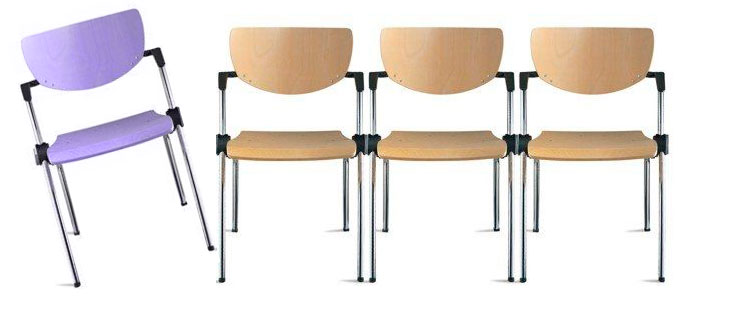
Take for example a row of chairs.

If all the chairs have the same colour and just stand there motionlessly, you wouldn’t know what to focus on.
I mean, yeah, you could randomly pick chair number 4 as your focal point, but nothing special is happening anyway.
But have one of them be a different colour and about to fall over, that’s what you’re going to look at.
That is not to say everything HAS to be unbalanced.
But there should at the very least be something different.
Having two identical fighters on two sides of the ring is boring.
Having one fighter be a huge muscled figure and the other very skinny and weak is a bit more interesting, but it’s very heavily on the muscled guy’s side.
Having one fighter be a huge muscled figure and the other be a death robot, now THAT is interesting.

You don’t need to design a character that for some odd reason equips everything on his left shoulder, but at the very least have something else on his right side.
If your character has a shoulder pad on his left shoulder, have him have a claw on his right hand.
This is not to say there’s no place for characters that look completely symmetrical, but you do need to realize the implications with such a design.
Such a design gives a feeling of uniform, safe, a character that’s not really threatening and generally has no personality to them.
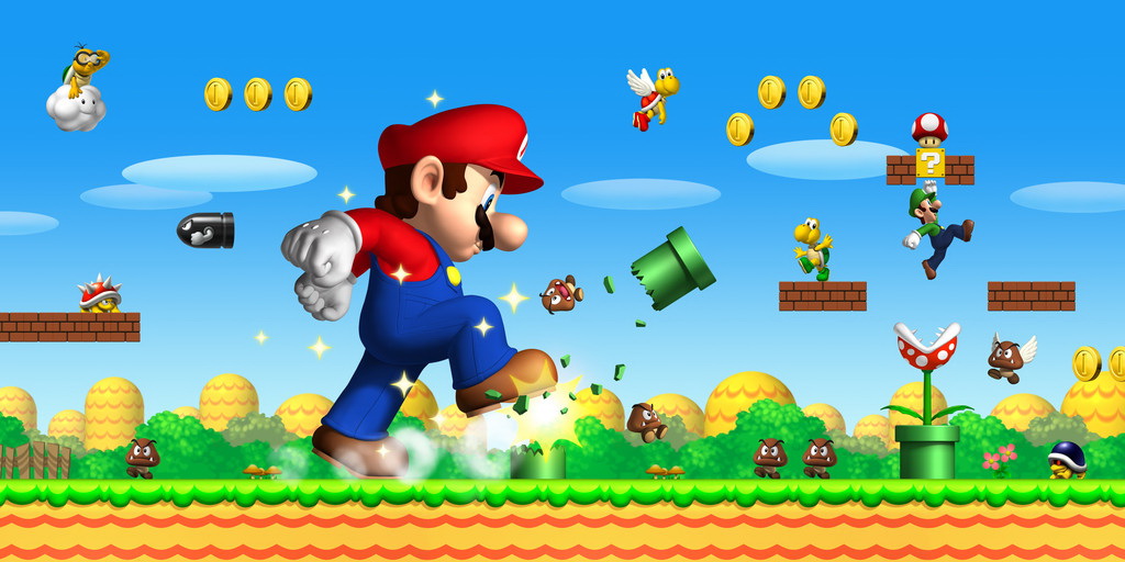
That’s the reason why Mario is so symmetrical, because in the end Mario games aren’t about the character of Mario, but the environments and the great level design.
Having your character be asymmetrical gives more of an adventurous feeling, sometimes even threatening if done right.
And that’s why Sonic has that smile on his cheek rather than in the middle.
Hell, that’s the reason why Sonic as a character tends to tilt his head to the side, to add more asymmetry to his design.
The spikes on his head are very different from the round shape of the front of his face.

The difference can also be seen in the same franchise.
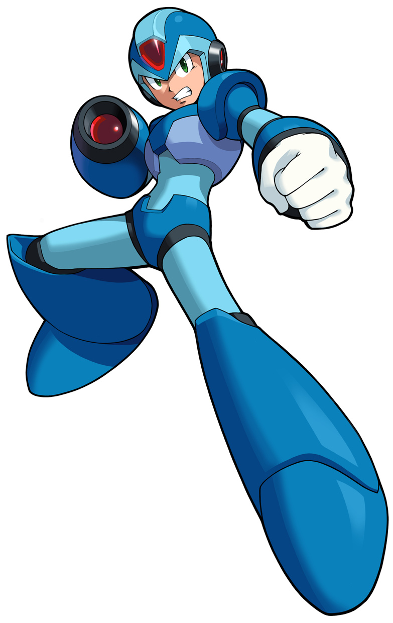
Take Megaman X and Zero.
Megaman X is almost completely symmetrical, besides his X Buster, which can be summoned to both hands anyway.
Zero on the other hand has that nifty hair of his that usually flows to one side, and as an extra touch from Megaman X3 on he has his Z-Saber stick out to one side. His left shoulder pad also has his symbol on it while the other side doesn’t.
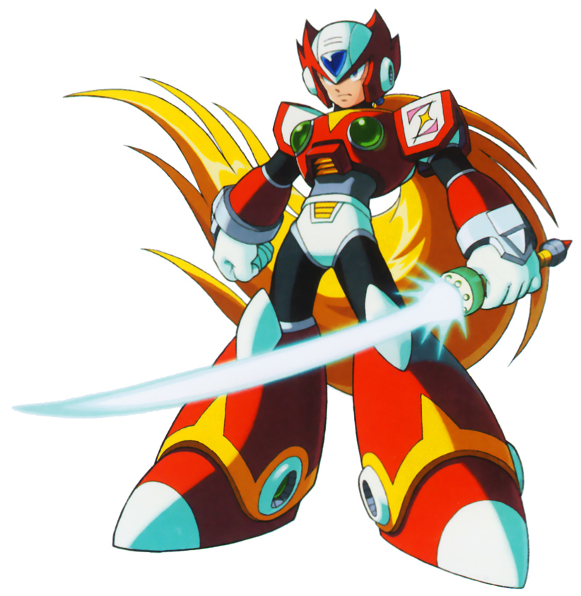
Now, guess which one of the two ended up being more popular.

I rest my case.
